

- Download & open the Excel Spreadsheet:
DarwinBNP.xls (click the underlined text). - If Excel opens the file in protected view (a red banner will appear across the top of the screen), click the File menu, and click on the icon: "Edit anyway" to allow chart copying. If you do not do this, you are only allowed to copy a static image of the chart.
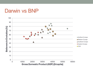
- Highlight the cells C1 to D7
- Choose the Insert tab, click the XY-chart and select the layout without lines.
- Click the Choose Data button, highlight the "Series 1" data and select edit.
- Click the button to the right of the "Series Name" input text box and select the B1 cell (end with clicking the same button on the popup dialog box). Press OK.
- Press the "Add button", click the selection box to the right of the "Series name" text box and select the B8 cell. Return by clicking the same icon on the popup. Likewise, select C8-C13 for the X-data and D8-D13 for the Y-data.
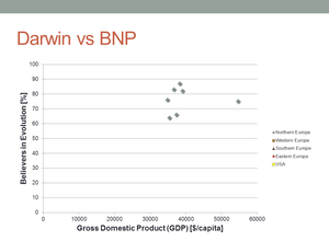
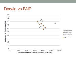
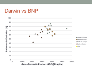
- Continue doing this until you have five series; Four for different parts of Europe and one for USA. End with pressing OK.
- Select the newly created chart and copy it (Ctrl + C or Edit -> copy).
- Insert an empty slide in a PowerPoint slideshow and select the Title + Content layout.
- Click on the border of the content box and paste your chart (Ctrl + V or Edit -> Paste).
- Choose the Design tab of the Chart tools group (to the very right of the ribbon) and selct a different typography for the chart.
- Choose the Animation tab, and click the "Fade in" animation button.
- To the right of the Animations, click the "Effect Options" button and select "By series"
Bonus task:
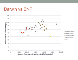
- Apply titles fo the X- and Y axes (see the animations above)
- Apply different layouts for the Eastern Europe and USA data series (double-click the series and select a different marker/size/color).
Animating by Category instead of By Series
- Download & open the Excel Spreadsheet:
DanishDeaths.xls (click the underlined text). - If Excel opens in protected view, (see point 2 above), choose "Edit anyway".
- Copy the chart.
- Create an empty slide with the layout "Title + Content" in PowerPoint, select the content box and paste the graph,
- Choose the animation tab and apply the "Fade In" animation.
- Choose the "Effects options" to the right of the Animations and select "By Category".